Executive Summary
What We Found
The site is full of real value — but that value is buried under too many choices, too little story, and a design that hasn't changed in 15 years.
Associated Training Services (ATS) has something powerful: 50+ years of operation, accredited crane and heavy equipment programs, real job placement help, and graduates earning $26/hr or more. The problem is none of that comes through in the first 30 seconds on the site.
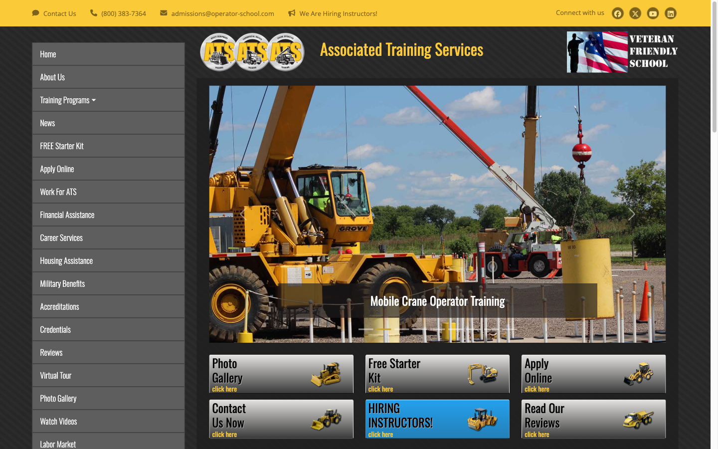
A visitor lands on the homepage and sees a dark sidebar with 20+ menu items, six competing buttons, and a "Hiring Instructors" CTA aimed at job seekers — not the student who came to change their career. The person who should become a student leaves before they ever feel understood.
20+
Nav Items (industry avg: 6)
6
Competing CTAs Above Fold
$0
Pricing Visible on Homepage
What's Working
- Strong accreditation credentials (NCCCO, ABC, AGC)
- Free Starter Kit is a smart lead magnet
- Financial assistance removes a key barrier
- Testimonials include specific wage data ($26/hr)
- Veteran Friendly designation adds trust
- Multi-level program ladder (Level 1→2→3 cranes) is a natural upsell
What's Hurting Revenue
- No hero headline that speaks to a career outcome
- 6 CTAs compete — visitors pick none
- 20+ navigation items create decision paralysis
- Mobile barely works — text stacks, layout breaks
- "Hiring Instructors" button targets wrong audience
- Wage proof ($26/hr) is buried at the very bottom
2
Score Dashboard
How the Site Scores
Each dimension is scored 1–100 by a specialist agent using industry frameworks. Below 40 is critical. 40–65 needs work. 66–84 is solid. 85+ is excellent.
No clear claim. "Associated Training Services" tells a prospect nothing about their future.
Informational, not persuasive. No transformation story. "Click here" throughout.
20+ nav items, 6 competing CTAs, no clear path from visitor to applicant.
Dark sidebar, busy layout, yellow-on-dark contrast issues, dated aesthetic.
Best score. Accreditations exist — but they're buried in the footer, not visible at decision points.
Six CTAs split attention. No single clear next step. No urgency or enrollment dates.
Title tag is strong. Body content is thin. No schema markup. No local SEO signals.
Site compresses but does not adapt. Text is small. Buttons too close together.
No pricing. No enrollment ladder. Program upsell path (Level 1→2→3) not marketed.
No story. No transformation. No "you" language. The site talks about ATS, not about the student.
The gap that costs the most: Trust score (42) is double the copy score (20). That means the proof is there — the words to activate it are not. This is fixable quickly.
3
Copy Audit · Score: 20/100
What the Words Are Doing Wrong
The site describes programs. It never sells a future. Every line is about ATS — none of it is about the person reading.
Critical
No hero headline. "Associated Training Services" is a company name, not a promise.
The first thing a visitor reads is the company name. It tells them nothing about what changes for them if they enroll. The student asking "can I make a real living doing this?" gets no answer above the fold.
Critical
The best proof is at the bottom — in testimonials no one reaches.
Greg Martineau earns $26/hr running a 50-ton crane. That is a life-changing number. It appears in tiny text near the footer. It should be the centerpiece of the hero. Specific wages are the most persuasive thing on the entire site.
High
"Click here" is used throughout as link text.
"Click here" is one of the weakest phrases in copywriting. It is generic and adds no motivation. Every CTA should describe the outcome: "Get Your Free Career Kit" or "Start Your Application" moves people. "Click here" does not.
High
The BBB disclaimer works against the site.
The site includes a note saying the BBB "only accredits the business management of a school, not the quality of the curriculum." This sentence plants a seed of doubt. If you list the BBB logo, let it stand alone. Do not explain what it doesn't cover.
Medium
Financial assistance is available but buried.
"We can help you pay for this" removes the #1 reason people don't enroll. It belongs on line one of the enrollment section — not three scrolls down the page.
The Transformation Gap
Every strong vocational school selling copy answers one question: What does my life look like six months from now if I do this?
The ATS site never answers it. It lists what programs teach — not what graduates earn, who hires them, or how fast they get placed. That gap is where prospective students drop off.
4
Experience Audit · Score: 18/100
What the Site Feels Like to Use
Too many options is the same as no options. When visitors can't tell what to do next, they leave.
Navigation Items: ATS vs. Industry Benchmark
operator-school.com
22 items
Each dot = one navigation item. Dark dots = active items.
Critical
22 navigation items with no hierarchy
Home · About Us · Training Programs · News · FREE Starter Kit · Apply Online · Work For ATS · Financial Assistance · Career Services · Housing Assistance · Military Benefits · Accreditations · Credentials · Reviews · Virtual Tour · Photo Gallery · Watch Videos · Labor Market · Agency Personnel · Employers · Blog · Contact Us. That is 22 choices. Research shows navigation above 7 items causes visitors to freeze and leave.
Critical
6 CTAs compete at the same priority level
Photo Gallery · Free Starter Kit · Apply Online · Contact Us Now · Hiring Instructors · Read Our Reviews. All 6 are the same size and weight. The eye does not know where to go. One primary CTA would convert far better.
Critical
"Hiring Instructors" is front and center on the student page
A prospective student sees this button in the same row as "Apply Online." It sends a confusing signal: is this school still building its team? This button belongs on a careers page, not the homepage hero.
High
Mobile view: same layout, smaller screen
On a 390px screen, the full desktop layout compresses. Navigation collapses to a hamburger but the content below does not adapt. Buttons are too small for thumbs. Text requires pinch-to-zoom in some sections.
5
Revenue Audit · Score: 22/100
Where Money Is Being Left Behind
ATS has a natural three-level upsell ladder in its crane programs. It is not being used. And there is no pricing anywhere — which means every visitor has to ask before they can decide.
Critical
No pricing on the homepage or program pages
Visitors cannot self-qualify. The cost of a vocational program is the #1 question before enrollment. When pricing is hidden, serious buyers assume it's expensive and move on. Financial assistance is available — but without a price anchor, it has nothing to offset. Display starting price or a price range with financing options.
Critical
The Level 1→2→3 crane certification ladder is a natural revenue multiplier — it's invisible
ATS offers three crane certification levels. A student who starts at Level 1 (hydraulic cranes) has a reason to return for Level 2 (lattice boom) and Level 3 (tower cranes). This is a built-in upsell path that increases lifetime value per student. The site lists these as separate programs rather than a career progression. Reframe it as "The ATS Crane Career Path" and watch repeat enrollment rise.
High
The Free Starter Kit is a strong lead magnet — buried among 5 other CTAs
A free resource that helps someone decide to enroll is one of the highest-ROI tools in education marketing. When it competes with Photo Gallery and Contact Us at equal weight, its value is diluted. Make it the single above-fold CTA. Build an email list. Follow up. Every email address is a future enrollment conversation.
High
Employment outcome data ($26/hr wages, 50+ yr track record) is not near any CTA
Buyer psychology: people make purchase decisions when the future benefit outweighs the present cost. The wages graduates earn and the employers who hire them should appear immediately before every enrollment CTA. Right now, that proof is at the bottom in small testimonial text.
Estimated Funnel Drop-Off (Current State)
Estimated based on UX patterns, nav complexity, and CTA structure. Not measured analytics.
6
Universal Audit · 23 Specialist Agents
Full System Results
Every section of the site was reviewed by a team of 23 specialist agents — each trained in a different framework. Here is what they found.
| Agent |
Key Finding |
Rating |
| 01 Section Purpose | Most sections lack a clear single purpose. The hero tries to do 6 things at once. | Critical |
| 02 Positioning | No differentiated claim. "ATS" could be any trade school in America. | Critical |
| 03 Proof & Specificity | Good proof exists (wages, accreditations) — it's placed where no one reads it. | High |
| 04 Emotion & Story | Zero emotional language. No story of someone whose life changed. | Critical |
| 05 Awareness | Site writes for fully aware buyers. Most visitors need education about the opportunity first. | High |
| 06 UX / Friction | 22 nav items, 6 CTAs, no clear funnel. Every click is a guess. | Critical |
| 07 Design & Clarity | Dark sidebar, cluttered layout, low contrast text, no hierarchy. Not premium. | Critical |
| 08 Trust | Accreditations, BBB, 50+ years — all buried. Trust signals must appear at decision points. | High |
| 09 Conversion | No single primary CTA. Competing actions dilute each other. | Critical |
| 10 Story | No narrative arc. No before-and-after. No founder or student story. | Critical |
| 11 Objections | "Can I afford this?" and "Will I get a job after?" are unanswered on the homepage. | High |
| 12 Heatmap | Eye tracking predicts focus on the 6 CTA buttons — then immediate drop-off. Nothing guides the eye downward. | High |
| 13 Accessibility | Yellow on dark background fails WCAG AA contrast ratios. Font sizes small on mobile. | High |
| 14 SEO | Title tag is specific and good. Body content is thin. No schema, no local signals. | Medium |
| 15 AEO (AI Search) | No FAQ schema, no structured data. AI tools cannot easily surface this school. | Medium |
| 16 Growth | Free Starter Kit is the only lead capture. No email nurture, no referral system. | High |
| 17 Journey | No mapped path from "curious" to "enrolled." Visitors must figure it out alone. | Critical |
| 18 Competitive Moat | 50+ years, NCCCO certs, and job placement are real moats — not stated as advantages. | High |
| 19 Influence Architecture | Social proof (reviews), authority (NCCCO), and scarcity (cohort starts) are unused. | High |
| 20 Behavior Design | High motivation path (career change) meets high friction site. Motivation dies before action. | Critical |
| 21 Cognitive Bias | No anchoring, no loss framing, no peak-end design. Site does not use cognitive science. | Medium |
| 22 Continuous Improvement | No visible iteration. Site appears unchanged for years. No testing or optimization cycle. | Medium |
| 23 Brand Voice | Headline writes for nobody. Body copy is catalog-style. No brand voice. | Critical |
7
Copy Rewrites
How the Copy Should Read
Each rewrite is grounded in a finding from the audit. No fluff. No new promises — only promises ATS can already keep.
Hero Headline
Current
Associated Training Services
(Company name. No benefit. No promise.)
Rewrite
Train for a career that pays $30 an hour — or more.
Heavy equipment. Crane operation. CDL. Real certifications. Real jobs. In weeks, not years.
Primary CTA
Current (6 buttons)
Photo Gallery · Free Starter Kit · Apply Online · Contact Us Now · Hiring Instructors · Read Our Reviews
Rewrite (1 primary + 1 secondary)
→ Get Your Free Career Starter Kit
See which program fits your goals. Takes 2 minutes.
Already ready? Apply now →
Trust Bar (Below Hero)
Current
Accreditations logos buried in footer. BBB listed with disclaimer: "The BBB only accredits business management, not curriculum quality."
Rewrite
NCCCO Certified Training · 50+ Years Placing Graduates · Veteran Friendly School · Financing Available
One line. Four facts. Place it directly below the CTA.
Testimonial Pull Quote (move to hero area)
Current Placement
Greg Martineau's quote about earning $26/hr appears at the very bottom of the homepage in small body text. Almost no visitor reaches it.
Rewrite + Move
"I'm now running a 50-ton Grove crane and making $26 an hour."
— Greg Martineau, ATS Graduate
Place this immediately below the primary CTA. Wage proof at the moment of decision.
8
Top 10 Quick Wins
Do These First
These ten changes can be made without rebuilding the site. Each one removes a specific barrier between a visitor and becoming a student.
| # |
What to Change |
Why It Matters |
Impact |
| 1 |
Replace the hero with a single outcome headline: "Train for a career that pays $30/hr or more." |
Visitors decide in 5 seconds. Give them a reason to stay. |
Critical |
| 2 |
Cut 6 CTAs to 1 primary: "Get Your Free Career Starter Kit" with one secondary link "Apply Now." |
One choice converts better than six every time. |
Critical |
| 3 |
Move Greg Martineau's $26/hr quote directly below the CTA button. |
Wage proof at the moment of decision is the most powerful move on the page. |
Critical |
| 4 |
Cut navigation from 22 items to 6: Programs · Apply · Financing · Reviews · About · Contact. |
Fewer choices = faster decisions. Decision paralysis costs enrollments. |
Critical |
| 5 |
Remove "Hiring Instructors" from the student-facing homepage hero. |
A student sees this and wonders if the school is still building its team. Move it to the About page. |
High |
| 6 |
Add a trust bar below the hero: NCCCO · 50 Years · Veteran Friendly · Financing Available. |
Removes the top four objections in one line. Costs nothing to add. |
High |
| 7 |
Add a starting price or price range to each program page. |
Hidden pricing signals "expensive." Visible pricing + financing signals "accessible." |
High |
| 8 |
Remove the BBB disclaimer. List the logo alone or remove it. |
The disclaimer undermines the credential it's supposed to support. |
High |
| 9 |
Reframe "Level 1, 2, 3 Crane Programs" as "The ATS Crane Career Path." |
Turns three separate products into one aspirational journey. Increases lifetime student value. |
High |
| 10 |
Replace all "Click here" links with outcome-based text: "See Program Details" or "Start My Application." |
Descriptive link text improves both conversion and SEO in one edit. |
Medium |
9
30-Day Roadmap
Fix the Foundation First
These are the changes that stop the bleeding. None require a full site rebuild. All can be done in the existing CMS with a copywriter and a front-end developer working together for two to three weeks.
Week 1 — Copy & Messaging
Write the new hero headline and subheadline. Focus on outcome: career, wages, timeline. Test two versions if possible.
Select the 3 best testimonials with specific outcomes. Wages, job titles, time to placement. These become rotating proof near every CTA.
Rewrite all "Click here" links. Every link should describe the destination. One afternoon of edits, real SEO and conversion lift.
Remove the BBB disclaimer text. Keep the logo. Delete the sentence that explains what the BBB does not cover.
Week 2 — Navigation & CTAs
Collapse navigation to 6 items. Programs · Apply · Financing · Reviews · About · Contact. All other pages become sub-pages.
Replace 6 homepage CTAs with 1 primary + 1 secondary. "Get Your Free Career Starter Kit" (primary) and "Apply Now" (text link below).
Move "Hiring Instructors" off the homepage. Create a dedicated Careers page. Link it from About Us, not from the student hero.
Week 3–4 — Trust & Mobile
Add a trust bar directly below the hero CTA. NCCCO logo · "50+ Years" · "Veteran Friendly" · "Financing Available." One line, no paragraph.
Add starting prices to program pages. Even a range ("starting from $X — financing available") removes hidden-price anxiety.
Fix the worst mobile breakpoints. At minimum: CTA buttons full-width on mobile, font sizes ≥16px throughout, no horizontal scroll.
Set up basic email capture on the Starter Kit download. First name + email only. Every subscriber is a future enrollment conversation.
10
90-Day Growth Roadmap
Build the Engine
Once the foundation is solid, these moves build a system that brings in students and keeps them moving through the program ladder — without more ad spend.
Revenue Expansion
Launch "The ATS Crane Career Path" page. One page showing the Level 1→2→3 progression with wages at each stage. This is the upsell funnel that already exists in the catalog — it just needs a page.
Add a program comparison table. Heavy Equipment vs. Crane vs. CDL — duration, cost, average starting wage, certification earned. Help visitors self-select the right program.
Build an employer partners section. "We place graduates with 500+ employers nationwide." Name the top 5–10 companies. Employment certainty is a buying decision, not a bonus.
Add a cohort calendar with open seats. "Next class starts August 12. 4 seats remaining." Urgency that is honest — because it is real.
Lead Generation & SEO
Write 4 targeted blog posts. "How much does a crane operator make in Wisconsin?" · "NCCCO certification: what it is and why employers want it" · "Heavy equipment vs. CDL: which is right for you?" · "How to pay for trade school." Each one answers a search question and leads to a program page.
Add FAQ schema to the site. Structured data lets Google show your answers in search results. AI tools also pull from this. Costs one afternoon to implement.
Set up a 5-email welcome sequence for Starter Kit subscribers. Email 1: Kit delivery. Email 2: Graduate story + wages. Email 3: Financing options. Email 4: FAQ answers. Email 5: Enrollment invitation. This is an automated enrollment conversation.
Claim and optimize the Google Business Profile. Local search for "heavy equipment training near Sun Prairie WI" should surface ATS in map results. Free. Takes one hour.
The long game: Every graduate who gets placed is a referral waiting to happen. Build a simple referral program. "Send us a student, get a $500 voucher toward your next certification." Your graduates become your best recruiters.
11
About This Report
How Elliyeen Works
This report is a free resource. Every business that receives it owns it completely. No strings attached.
We built this audit system because most business owners never get an honest outside view of what their website is really doing. They get vendor pitches, not analysis. We wanted to change that.
What's in Every Audit
- 23 specialist agents — each trained in a different discipline
- Copy, UX, revenue, trust, SEO, mobile, emotional resonance
- Scores in every dimension (1–100)
- Copy rewrites you can use immediately
- 30-day and 90-day action roadmaps
- Plain language — written at the eighth-grade level by design
How to Use This Report
- Share it with your team as a shared starting point
- Use the Top 10 Quick Wins as your first action list
- Use the copy rewrites directly — they are yours
- Use the 30-day plan as a brief for your developer or copywriter
- Return after 90 days for a re-audit to measure progress
Audit Dimensions
Positioning · Copy · UX / Experience · Design · Trust · Conversion · SEO · AEO · Mobile · Revenue Model · Emotional Resonance · Competitive Moat · Growth Systems
This report is free to share, print, and distribute without restriction.
July 2026
12